What You Will Do:
- Watch the Khan Academy video: "Statistics Intro - Mean, Median, and Mode."
- Collect two temperature data sets in the Desmos Graphing Calculator: one for your hand and one for your classroom's air temperature.
- Make a graph to show how the temperature changes over time, and make a histogram to show how often each temperature value happens.
- Find the mean, median, mode, minimum, maximum, and range for both data sets. Use these to describe the center and spread of each set, and then compare the two sets.
- Use your graphs and statistics to answer the summary questions in the Google Docs worksheet: "Descriptive Statistics," and turn it in according to your teacher's directions.
- Mean: the average value (add all the data and divide by how many values).
- Median: the middle value when the data is put in order from smallest to largest.
- Mode: the value that shows up the most times in the data set.
- Minimum: the smallest value in the data set.
- Maximum: the largest value in the data set.
- Range: how spread out the data is (maximum minus minimum).
- Click to watch this Khan Academy video to learn more about these ideas.
- Click this link Temperature - Activity 1 to open the worksheet in a new browser tab. Click 'Make a copy' to save your version to your Google Drive.
Directions:
Data Collection:
- Use the USB-C cable to plug the Observe temperature sensor into your computer's USB port.
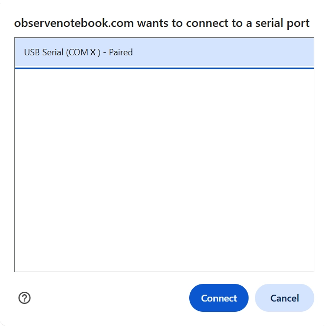
- Click the Connect button at the top-left corner of this page.
- Select the USB serial port (COM X) and click Connect. X varies by computer and is not important.
- Confirm that the status in the top-right corner says "ready 5 Hz."
- Set the sensor on the table and do not touch the metal part. This will measure your room's temperature. Notice that the temperature is displayed and a live red point appears on the y-axis of the graph.
- Click the Start button and collect about 10 seconds of room temperature. Then, pick up and hold the tip of the sensor between your fingers to measure your fingers' temperature for about 25 seconds. Notice that the temperature increases quickly at first, then slows as it approaches the temperature of your fingers. Next, set the sensor down on your desk and allow it to cool for about 25 seconds. Click Stop Collection to end.
- Optionally, click the small gray triangle to the left of the data table to view the time (t) and temperature (T) columns and data.
- After you finish collecting your data, click the Show Instruction button in the upper-right corner to continue the activity.
- Click the Show Directions in the upper-right corner to learn how to collect temperature data for this activity.
- When you finish collecting data, click the Zoom to Data button.
- To find the mean (the first type of average) of your data, click on the line below the data table and type m1 = mean(T). You can also click the "Show Keyboard" icon in the lower-left corner of the graph and select mean from the Functions menu.
- Graph the mean by typing y = m1. Notice that a horizontal line showing the mean is drawn across the data.
- Go to the next line and repeat the previous step, but instead of "mean," calculate the "median," the second type of average: m2 = median(T). You should see two different colored lines drawn across your data. Their values may be similar.
- Go to the next line and repeat, but instead of "median," calculate the "minimum": m3 = min(T). You should now see three different colored lines drawn across your data. They may have similar values because the data is not very spread out.
- Go to the next line and repeat, but instead of "min," calculate the "maximum": m4 = max(T). You should now see four different colored lines drawn across your data. They may have similar values.
- On the next line, calculate the range (how spread out the data is) by typing R = m4 - m3 (use uppercase R). The range is maximum minus minimum.
- On the next line, click the "Show Keyboard" icon, then select the functions button on the right. Scroll down to VISUALIZATIONS and choose histogram. Enter histogram(T, 0.01). Next, click the keyboard icon to close the keypad, then click the small zoom icon at the bottom of the histogram box. The histogram shows bars that represent how many temperature readings fall within 0.01-degree intervals. The mode (the third type of average) is shown by the tallest bar in the histogram. The value of the mode is read from the x-axis.
- Once you have found the mode, type on the next line m5 = followed by your mode value divided by 1, this will prevent a slider from being made. Then graph y = m5 You should now see a fifth line showing the third type of average.
- Compare the five lines. Since the data did not change very much, they should have similar values. You may want to use the "+" icon, in the upper-alpha right of the graph, to zoom into your graph and click and drag to reposition it for better viewing.
- When finished, click Capture Graph to copy your graph and paste it into your Google Docs worksheet.
- Scroll back up to the graph and click the Clear Graph button. This will delete the data in your table and reset the graph. You must export the data before clearing it if you plan to import and analyze it further in the future.
- Now you will compare the first data set with a new second data set.
- Set your temperature sensor on the table and allow its temperature to stabilize. Click the Start button and collect about 60 seconds of the room's temperature.
- When collection is finished, calculate all of the descriptive statistics by repeating the steps above in the Analyzing Your Data section.
- When finished, click Capture Graph to copy your graph and paste it into your Google Docs worksheet in the second frame, below the first.
- Answer all of the questions in your Google Docs worksheet and follow your teacher's directions for turning in your worksheet.