What You Will Do:
- Watch the Khan Academy video and review the key ideas.
- Interact with a light simulation and explore how light intensity changes with distance from a light source.
- Collect light intensity data in the Desmos Graphing Calculator as you move your phone lamp farther from the sensor.
- Compare function families (linear, rational, power, exponential decay) and use sliders to decide which family best models the relationship between distance and light intensity.
- Complete the Google Docs worksheet Light - Activity 1 Worksheet and submit it according to your teacher's instructions.
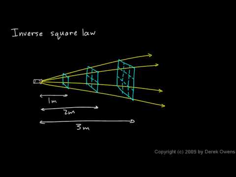
- Light intensity: a measure of how much light energy reaches a surface, commonly measured in lux (lx).
- Distance: how far the sensor is from a light source, measured in centimeters (cm).
-
Linear function: a function that changes at a constant rate.
The graph is a straight line. This model is useful when the data appear to follow a steady increase or decrease.
$$y = mx + b$$
-
Polynomial function: a function
$$y = ax^{2} + bx +c$$
-
Power function: a nonlinear function that involves a variable raised to a constant exponent.
Negative exponents produce decreasing curves, while positive exponents create increasing curves.
This family is often used for relationships that become steeper or flatter as distance changes.
$$y = ax^{p} + b$$
-
Rational function: a function with the variable in the denominator.
Rational functions can show steep decreases and asymptotic behavior.
They are appropriate when the data form a curved shape rather than a straight line.
$$y = \frac{m_2}{(x + b_2)^{2}}$$
-
Exponential decay function: a function in which y-values decrease by a constant multiplicative factor for equal changes in x.
The graph approaches a horizontal asymptote. This model is helpful when the intensity drops rapidly at first and then levels off.
$$y = ae^{kx} + b, \quad k < 0$$
- Interpolation of a model: using the graph of a mathematical model to estimate an intensity value for a distance that lies between the real data points. This shows how well the model agrees with measurements already collected.
- Extrapolation of a model: extending the pattern of the model to estimate intensity for distances beyond the range of the real data. Differences between extrapolated predictions and actual readings help to understand the limits of any model.
- Mathematical model: an equation or graph used to represent a real-world relationship between variables so that predictions can be made from the pattern.
- Click to watch the video to review these ideas before collecting and modeling your data.
- Click this link Light - Activity 1 to open the worksheet in a new browser tab. Click 'Make a copy' to save your version to your Google Drive.
- When your light sensor is connected, the cube below will begin rotating. Its illumination changes in proportion to the sensor's light intensity (Lux). Brighter light produces a brighter cube.
- Use your mouse to click and drag on the graph to draw your prediction. If you need to start over, click Erase Drawing. When you are satisfied, click Capture Drawing to copy the image to the clipboard and paste it into the Light - Activity 1 Worksheet worksheet and answer the related questions.
Directions:
Data Collection:
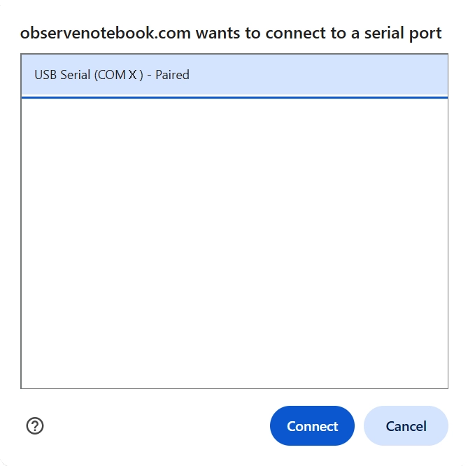
- Use a USB-C cable to plug the Observe light sensor into your computer's USB port.
- Click the Connect Sensor button to activate the sensor.
- Select the USB serial port (COM X). The X value varies by computer and is not important. Then click the blue Connect button in the pop-up window. The status will change to ready.
- Dim the surrounding light in the room, and position your computer screen so it does not shine on the sensor.
- Turn on a flashlight (or a phone flashlight) to use as a movable light source. Ideally, this should be the main light shining on the sensor.
- Scroll down to the simulation. Slowly move the light source closer and farther away, and observe how the illumination on the cube changes with distance. Complete your prediction sketch, then copy and paste it into your worksheet.
- Place a meter stick on your desk with the sensor positioned at the 0 cm end. Move the light source farther away until the reading does not change much. This reading is the ambient light in the room. This is your starting position for data collection.
- Add measurements one at a time by pressing the Add Point button. When prompted, enter the distance for the light intensity measurement. Your first point should use the starting position from the previous step. Then reduce the distance by 5 cm and add another point. Continue reducing the distance by 5 cm and adding points until the intensity is greater than 17,000 lux. That will be your last point.
- Clear Graph resets the graph. Capture Graph copies an image of the graph to the clipboard. Export/Import saves or opens a CSV data file.
- Click the small gray triangle to the left of the data table to view the sensor data (D and I) in the table.
- Click the Show Instructions button in the upper right to continue.
- Click the Show Directions button in the upper-right corner to learn how to collect data for this activity.
- Look back at your prediction drawing. From what you observed in Desmos, do you think the relationship between light intensity and distance is direct or indirect? Explain your reasoning in the worksheet.
- Compare the different function families shown in the folders to decide which type of function has the same shape as your data. The best match is the model whose graph stays closest to the data points across the entire distance range and levels off in a way that agrees with what you observed in your measurements.
- Use each folder one at a time to test the models in this order: Linear first, Rational second, Power third, and Exponential Decay last.
- Expand a folder - click the small gray triangle in the row next to the folder name to open it and view the function inside.
- Turn on each function and fit with sliders - click the circle to the left of the function entry. When the circle is selected, the graph of that function will appear over your data. Adjust the sliders to make the curve follow the points as closely as possible. Follow the instructions in your worksheet to record your predictions and explanations.
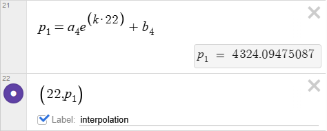
- Interpolation prediction - choose a distance inside your data range, estimate the intensity using your preferred model, plot that point in Desmos, and explain in the worksheet whether the estimate is reasonable compared to nearby measurements. Note: Below is an example calculation and an example of plotting a point using model four. To enter a subscript, use the underscore key after the letter. Typing "a_4" will create the first constant in the expression below. Label this point "interpolation."
- Extrapolation prediction - choose a distance outside your data range that is larger than your largest measurement, estimate the intensity, plot that point in Desmos, and explain in the worksheet why predictions outside the data range are usually less reliable than predictions inside the range. Label this point "extrapolation."
- After you adjust the sliders, judge the best fit model, and plot the interpolation and extrapolation points, click the Capture Graph button. This copies the graph to the clipboard. Then paste that graph image into your activity worksheet in the space provided for evidence of your best fit model.
- Try repeating the above steps to test an interpolated prediction using a different model and compare the results.